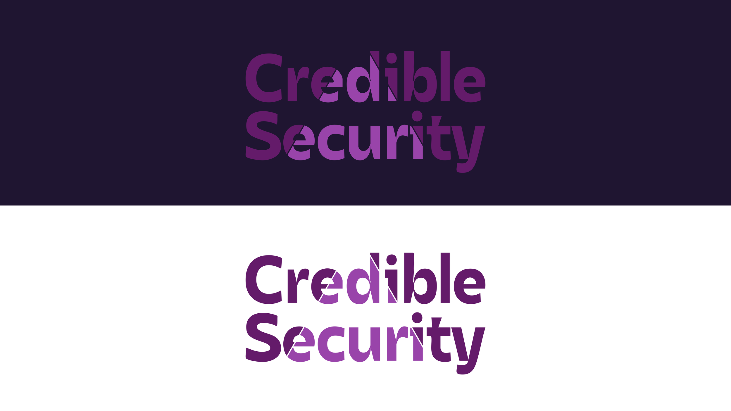
Branding: Credible Security
Problem
Any brand new company’s first hurdle is to get clients, gain their trust, and build brand recognizability. Most people alive in corporate America knows that requires a logo. I worked with the founding partners of Credible Security, Kim Burton, Josh Yavor, and Jessica Walters, to create a professional logo, choose brand colors, and a typeface to create the first evolution of their visual identity. Credible Security primarily helps B2B SaaS and Cybersecurity/IT product companies by guiding their customer’s cybersecurity journey, and helping them successfully execute towards business goals by tailoring services to the distinct needs of each client.
In conversations with Kim, I gleaned it was important to create a safe space for their clients. Many are SMBs who need a reliable and trustworthy partner in securing their business (although Credible Security creates advanced cybersecurity outcomes for organizations of all shapes and sizes). With trust is a core brand principle I relied heavily on triangle forms for the logo, alluding to the triangle of trust (authenticity, logic, and empathy) which is referenced heavily in the cybersecurity industry.
LOGOS: ROUND 1
With a soft purple color favored by the founding partners I knew they were ready to subvert some of the cybersecurity design trends that lean heavily into tehno-futuristic blues, deep backgrounds, and bright reds. But the difficulty is to break the status quo enough to look distinct, but not so much to look unrecognizable to the industry. While it’s difficult to stand out in a sea of startups, the customer does rely on visual cues like glowing green code to know at a quick glance, “Oh! This is a tech company!”
Here I pushed the boundaries with the softness of shapes within the text. I used the angle of the lowercase Y to determine the angle of the tent imagery. With a soft organic typeface I figured I could literally create a soft, safe space of refuge for the customer within the tent. I even imagined animation with a small light illuminating the inside of the tent.
Utilizing the same tent symbolism, I scaled back the “soft” factor. It renders more clearly as “tech” territory, but the imagery is harder to find. When the solid side of the tent became a lined path the abstraction factor was cranked to eleven.
Following the lined nature of the tent, I imagined a pathway that Credible could lead the customer down. “A more secure future is right this way if you follow me! I’ve got a map, I know where to go.” The reassurance of a “trail guide” persona with the combination of the triangle of trust led me to this abstracted 2 lane road triangle, with the road disappearing into the distance. The chunky text created the boldest option.
Knowing what it takes to truly guide non-security people through implementation of security principles I created this implied triangle option. Cybersecurity is so often about making the unseen into something tangible. In this version the three corners of the triangle are highlighted, but the triangle itself is found in negative space. It begs the viewer to see an unseen element in the foreground as a vital visual component. This concept was chosen by the team and moved forward to the next round. However, the corner elements had to change from circles to avoid accidental Pac Man shapes. Waka waka waka.
LOGOS: ROUND 2
Now that we knew the implied triangle most represented the mission of Credible Security’s brand it was time to push that concept. Here I used a color change to show a hidden triangle within the text. Ultimately this prevented the triangle from standing as a foreground and distinct element.
One successful element from the “2 lane road” first draft logo was the boldness of the text. Its legibility at small scale was unmatched. I pulled in capital letters and a heavier weight of the chosen font in this draft of the implied triangle. To strengthen the non-edge edges of the triangle, I allowed it to clip off the corner of the last E in Credible, and the S in Security. I then carried the clipped corner to every E to create a more customized feel to the letterforms.
Here I used many of the same principles of clipping letter edges, and matching the angles of letterforms to the triangle. And though this version doesn’t quite match the “implied” part of the triangle, I thought the line break mirrored nicely the </ text used in coding every day. Nothing solidifies a connection with cybersecurity stronger than dropping code (or its visuals) into a logo.
logo: final draft
Primary logo in a horizontal arrangement. The changes from round 2 to the final version are not easily visible to an untrained eye. Ultimately any changes made were balancing proportions for legibility. Can the text scale up in proportion to the triangle? How much of the text should define the edge of the unseen triangle? If the triangle is proportionally smaller, should the weight of the corner pieces increase to compensate so it’s not dominated by the text? All of these questions were answered with pixel-by-pixel adjustments.
Primary logo with a stacked text arrangement. This stacked text version was important for use cases like social and mobile sites where horizontal dimensions are much more limited than vertical dimensions. In a web header for example, the primary horizontal logo would take up too much real estate. This stacked alignment essentially completes one entire side of the triangle, but the right corner grounds the shape in space. I altered the angle of the Y to match the triangle, something not required in the horizontal logo.
The standalone triangle sans text can be repeated and used in illustrations, patterns, or broken apart to form something entirely new.
Even with just one portion of the logo mark, the implied triangle remains present. This stripped back piece is the site favicon.


