Branding: Ann Arbor Street Art Fair, The Original
Ann Arbor Street Art Fair, the Original is a nonprofit arts organization that provides equitable access to arts education through our community initiatives. Since 1960 they’ve been dedicated to presenting an award-winning top tier annual art fair showcasing original works of art by local, national, and international artists. They are one of the three nonprofit art fairs that collectively create the larger Ann Arbor Art Fair.
First steps forward
Given their decades’ long history there was great affinity from the public to the old AASAF logo, even if it was not the most legible design. Their other visual identity elements were not formalized in any replicable way. Refreshing the visual identity meant balancing the existing brand equity of guests who had attended the fair annually for years with the need to memorably connect to new patrons.
New logo
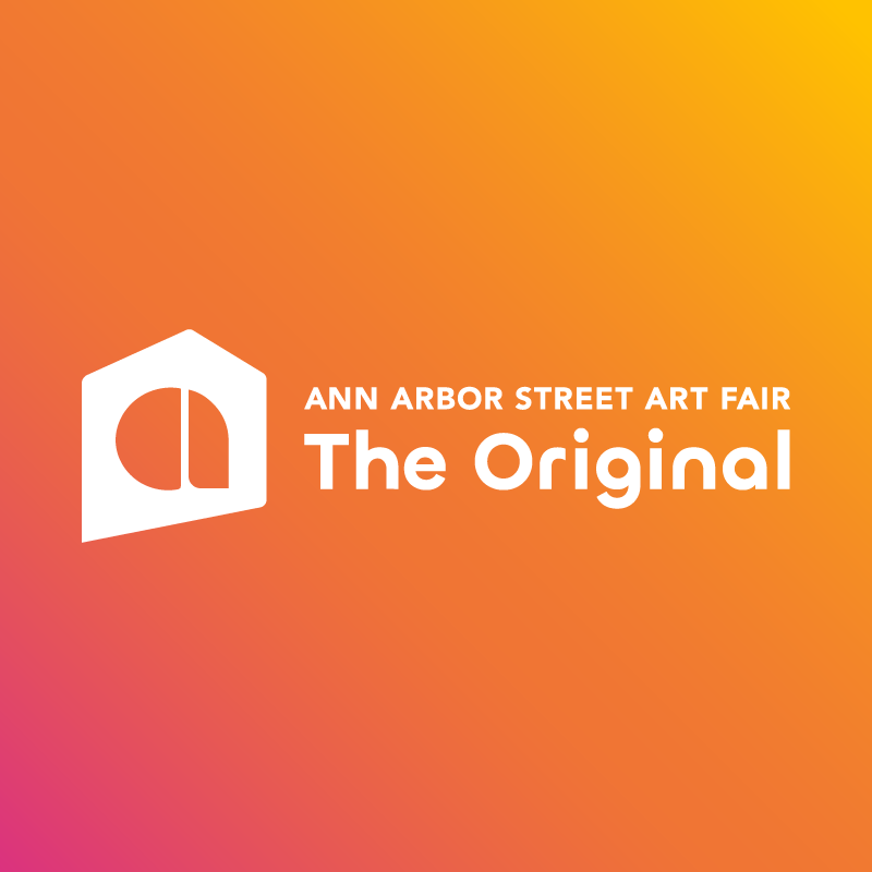
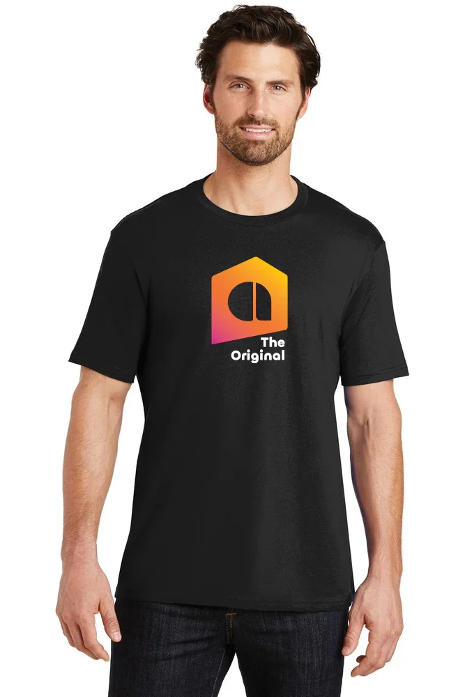
Designed by Steven Samuels, an AASAF board member and talented designer, the new logo maintains effective elements of the prior logo while creating an impactful mark. It leans into the 1960’s retro roots of the fair while keeping the iconic tent that patrons have come to recognize as AASAF.
Logo prior to 2023. Busy colors and busy text make this version illegible although the handwritten strokes feel artsy and quirky.
Logo from 2023-2024. With the colors removed it strips back one of the distracting elements.
Logo from 2025 onward. With sans serif text our name is easily read and maintains personality.
Although initially the two logos may seem visually unrelated, both utilize the tent shape and a lowercase “a” shape in the negative space. The artist tent visually represents the plane where the stated connection between artist, art, and the community interface. Highlighted in blue above the connection between the two is more apparent.
The logo boasts some flexibility in arrangement which allows for pieces to become iconography, photo framing, textures, and more. However, what you see above is the most commonly used arrangement of the logo.
The rest of the picture
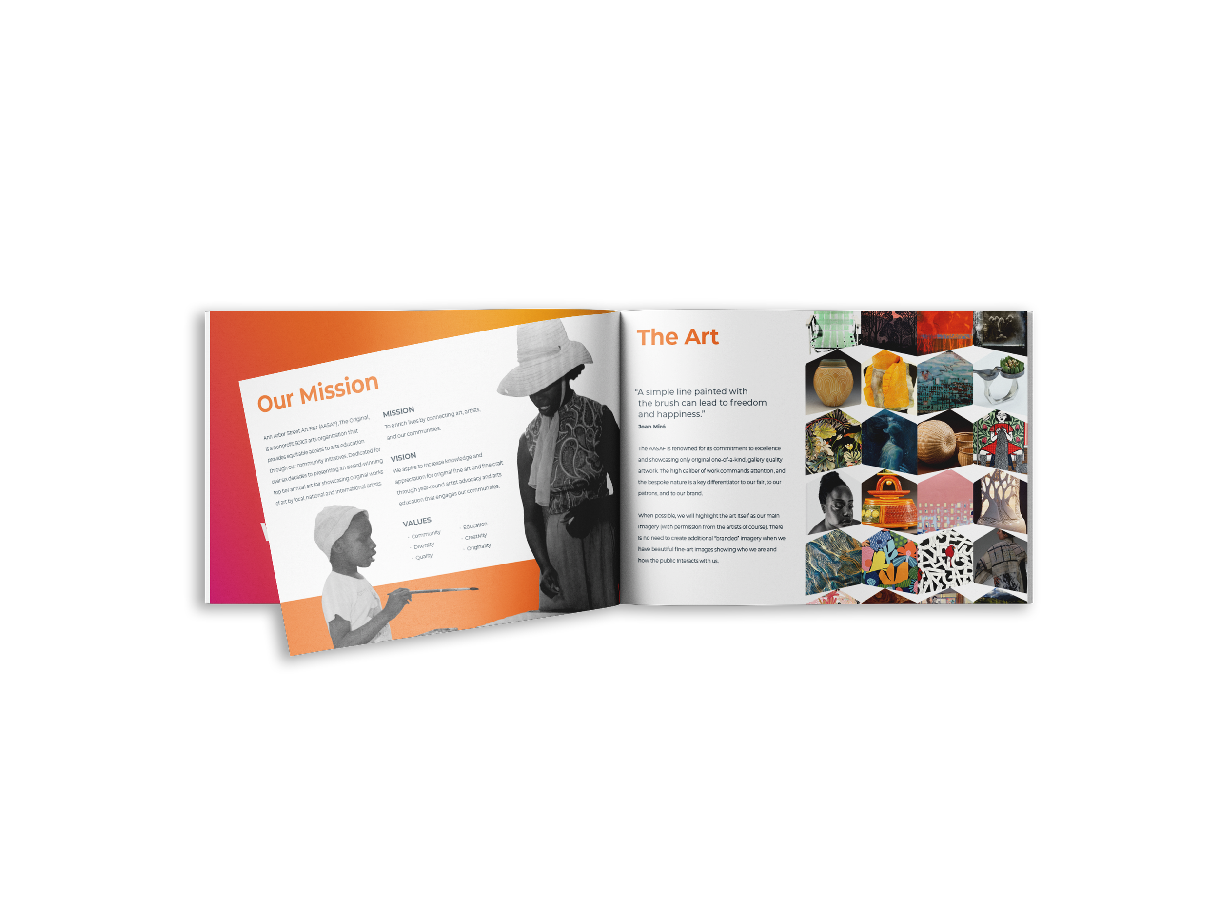
After the logo launched the need to complete the visual identity was more apparent than ever. With buy-in from the AASAF board we began with brand guidelines. The creation of guidelines gave a foundation, speed, and purpose to all other asset created afterward.
Brand guidelines
The brand guidelines include everything needed for someone without knowledge of our organization to tell our story. It was presented to board members and is now available as a resource to our partners in PR and the media. The first draft included our mission and vision and highlights the art, artists, our community programs, logos, colors, icons, photography, and typography. The second draft will expand upon naming conventions, social media standards, and more.
social
While we have other platforms, the majority of our social presence extends across both Instagram and Facebook for the three properties of the Ann Arbor Street Art Fair, the combined Ann Arbor Art Fair, and Dart for Art (our annual fundraising race).
The AASAF socials lacked visual consistency. and clarity. Nearly every post used too much text on top of photos, sometimes with multiple fonts. Each post was difficult to read with the textures layering one on top of the other.
Additionally there were different typefaces from post to post. The overall image grid of our profile looked chaotic, as if the imagery were made by different people each day.
To bring consistency I utilized our brand typeface across each post. Wherever possible I brought in our brand colors and logo, especially when supporting our artist’s work. For clarity I moved as much text as I could to the caption, ensuring that any text on images was there only to grab attention, not deliver every detail possible.
Our highest engagement social post to date. Following our brand guidelines I made our artists and their art the main focus.
An example of our Artist Drop series that highlights juried artists. Part of the promotions our artists receive with their booth cost. The tent shape is pulled from our logo.
Highlighting our Featured Artist whose art becomes our annual commemorative poster, informing merchandise and other promotional items each year.
website
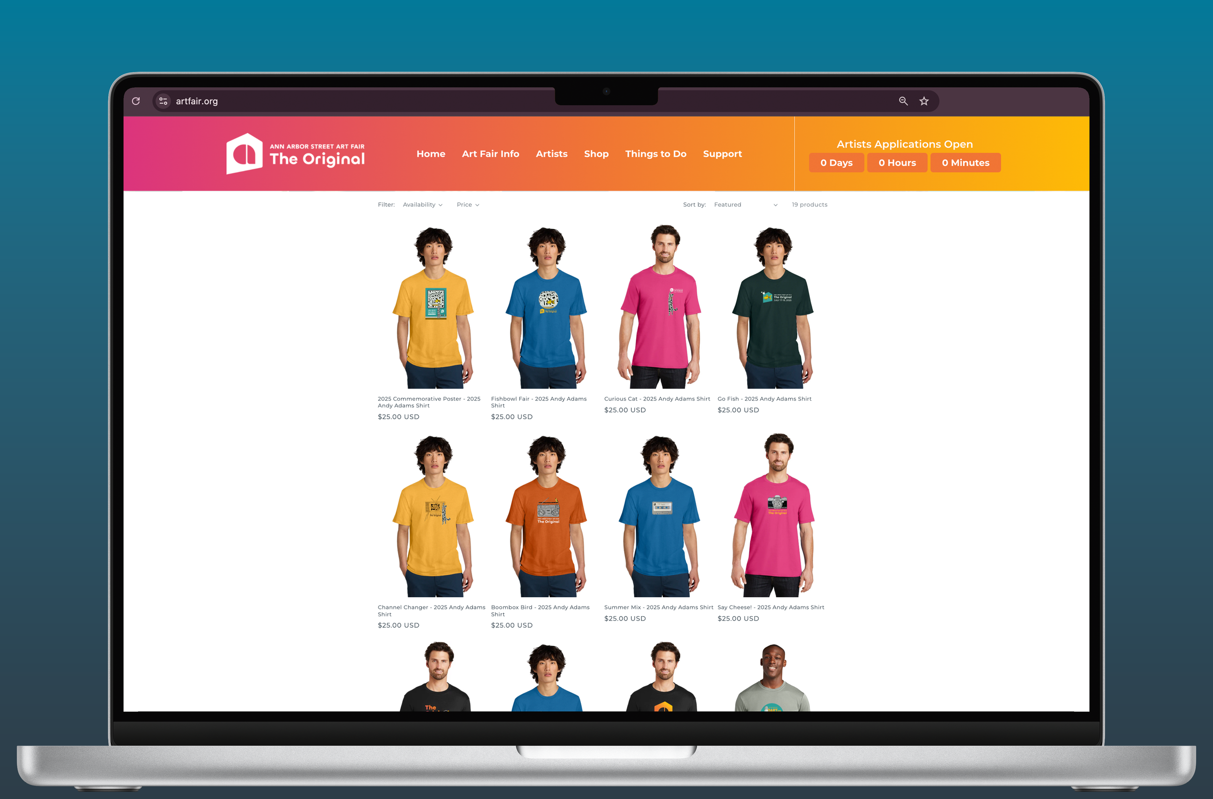
Our website was redesigned by Q & M Agency. With the creation of my brand guidelines I art directed the later website drafts for consistency and usability.
We launched our first year-round online store as well! After the creation of one user guide and many merchandise mockups created the store went live. Given the annual nature of our event, our budget for the year is partially determined within the earnings of a few months. Creating an avenue for year-round sales helps bring a more consistent passive revenue stream while also benefiting guests who missed buying merchandise at the fair, have moved away, or just want to support the arts outside of our summer event!
signage
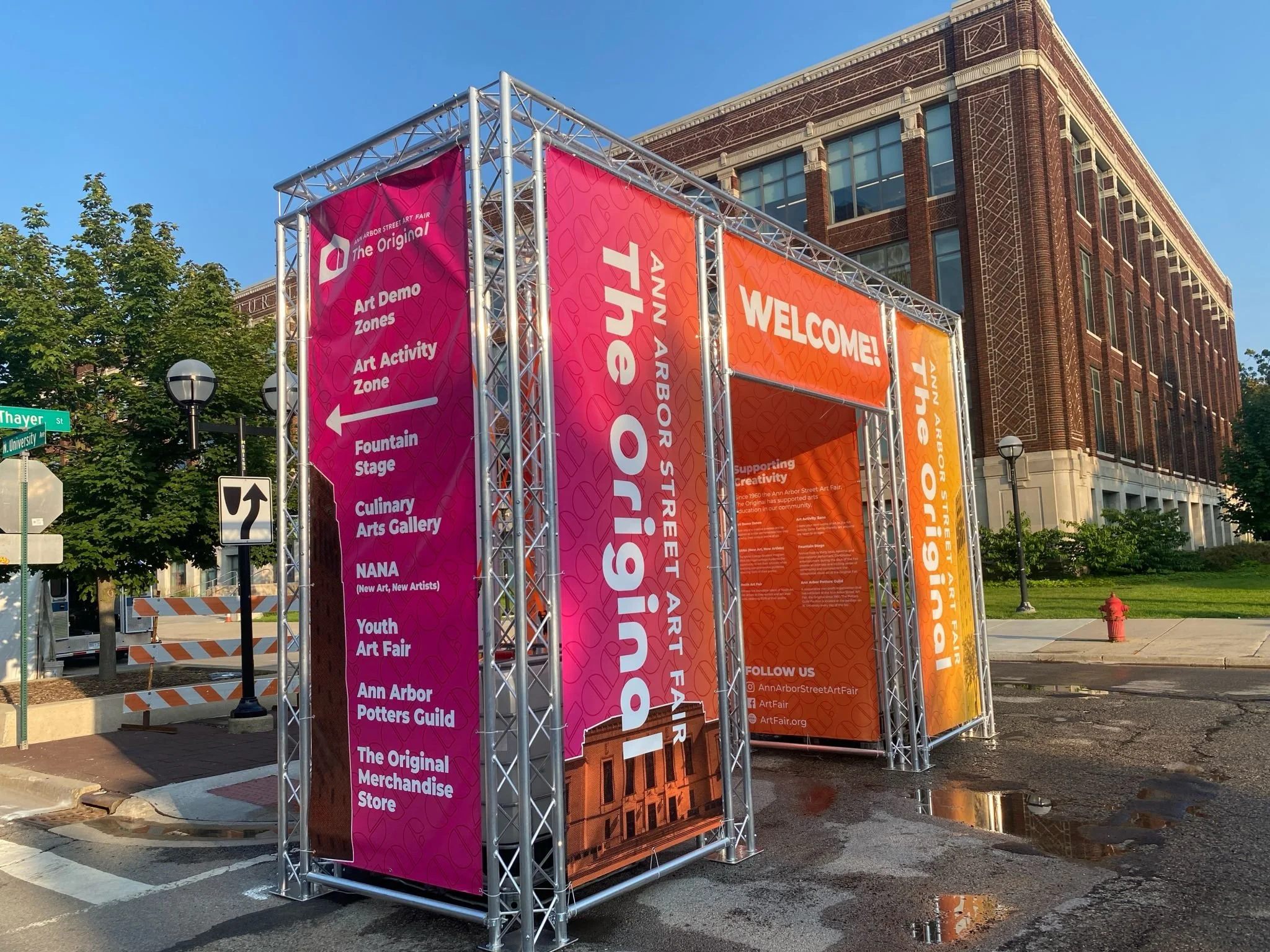
The main goal with signage was to create something bright, recognizable, and lasting. Every sign featured our brand colors in the patterns and text wherever possible.
BRIGHT
Although we feature many very serious artists, our guests still expect a fun summer outing. And nothing says summertime like drinking a cold beverage, and strolling the fair fully of bright oranges and pinks everywhere!
RECOGNIZABLE
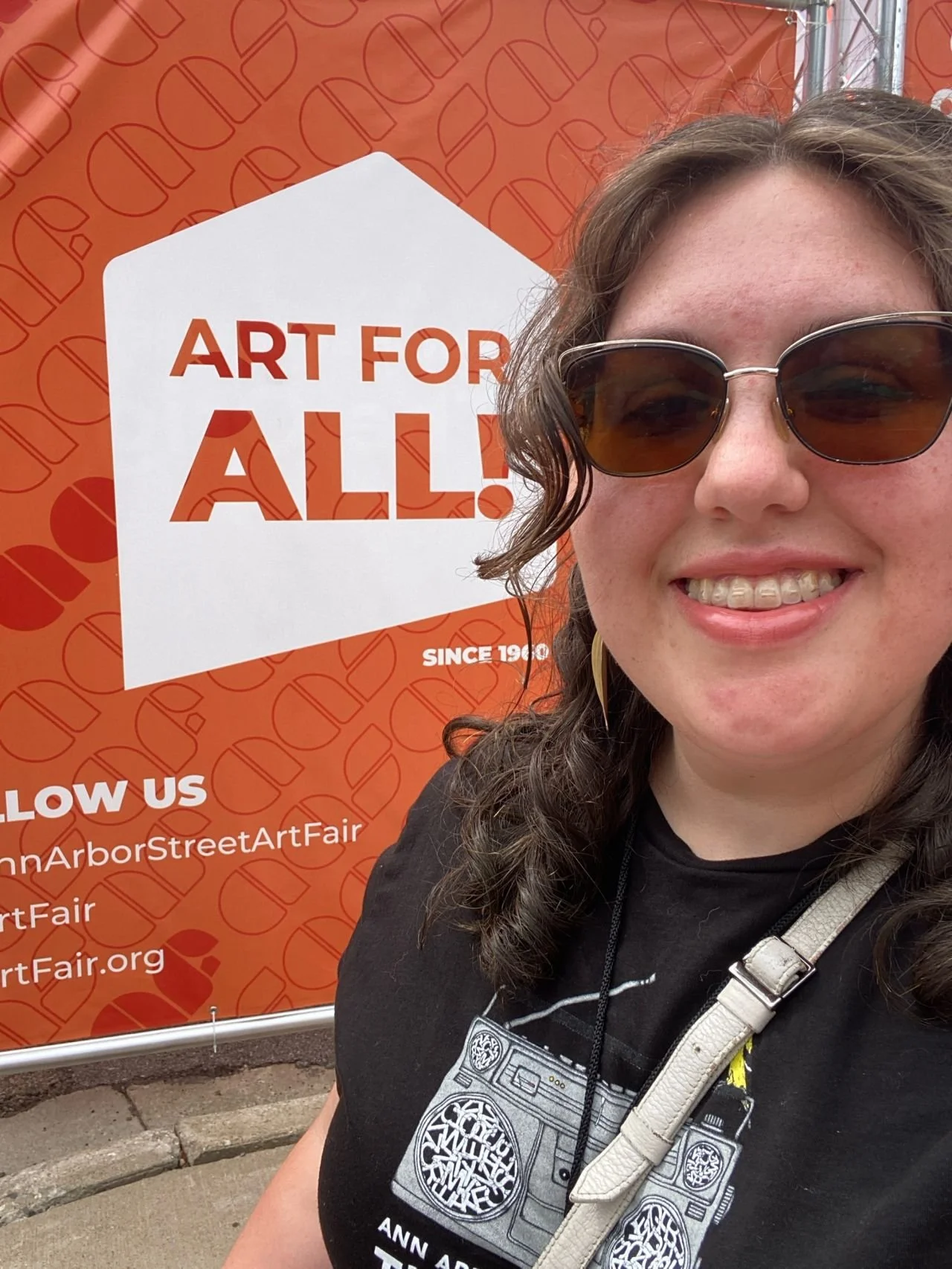
Our AASAF orange featured prominently. This becomes a matter of way-finding for our guests trying to find our fair among the 3 concurrent fairs that create the Ann Arbor Art Fair. Additionally this is the largest amount of physical visual space we had to cement our new branding with long time patrons.
LASTING
In past years signage had to be replaced due to copy. Wherever possible I removed dates and names to create evergreen pieces which also helps the annual budget.
The backside of the large truss.
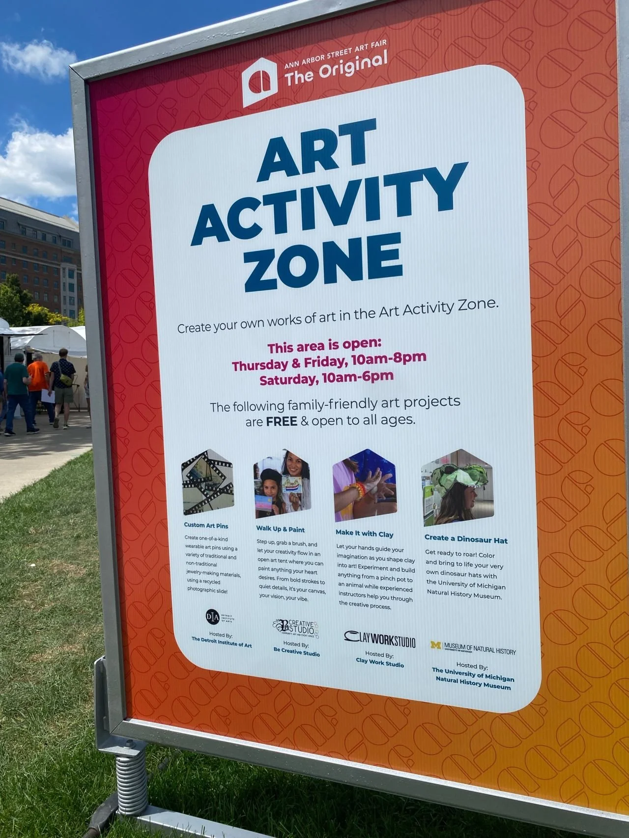
One of many way-finding signs across the fair’s footprint.
Merchandise
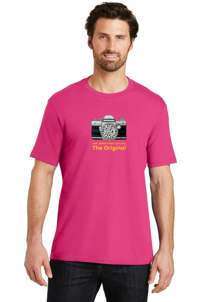
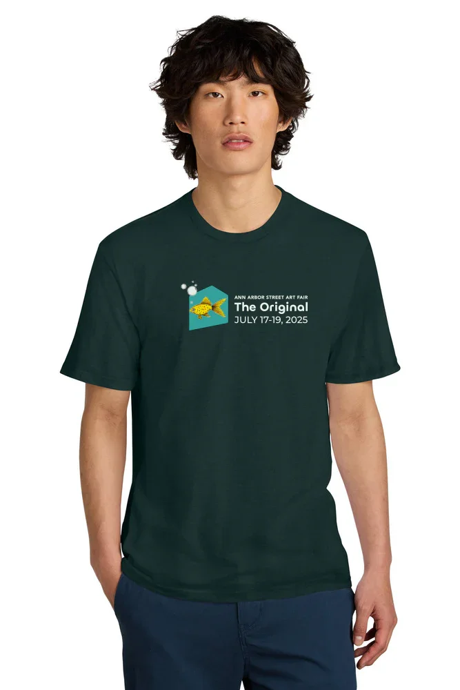
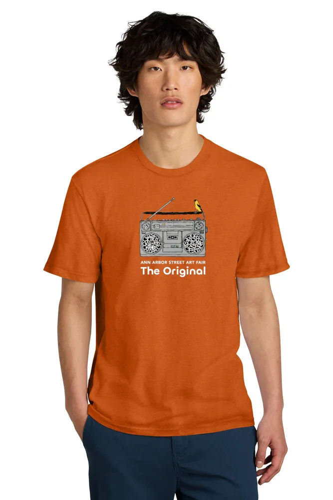
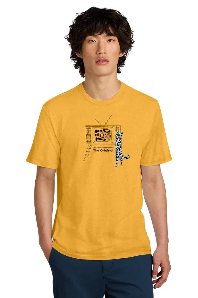
All merchandise created from the 2025 Featured Artist Andy Adam’s artwork or our new logo. As with most brand merchandise it’s an opportunity to play! Brand consistency doesn’t go out the window, but ultimately I want people to stop in their tracks because something looks cool, then link it to our brand!
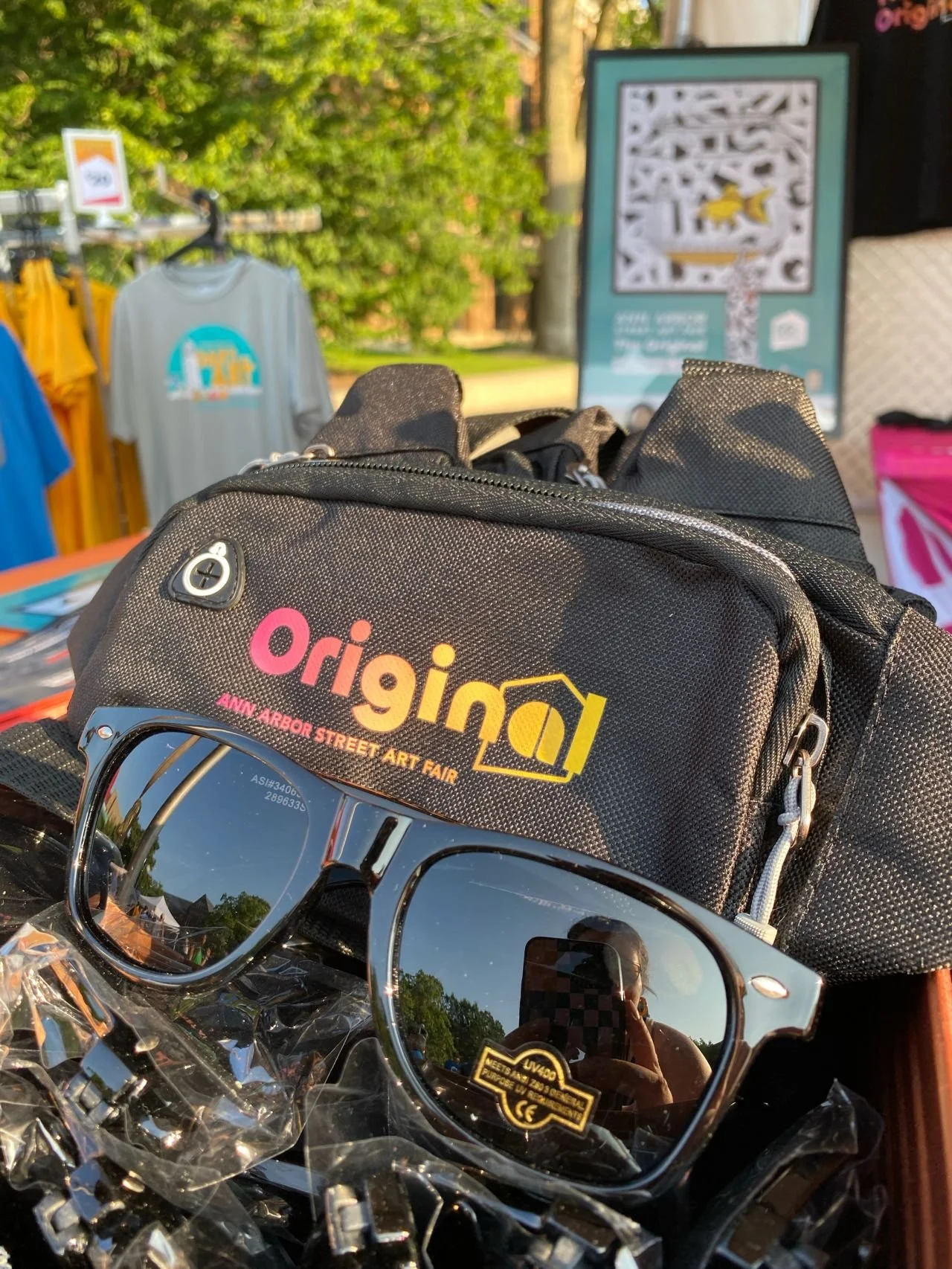
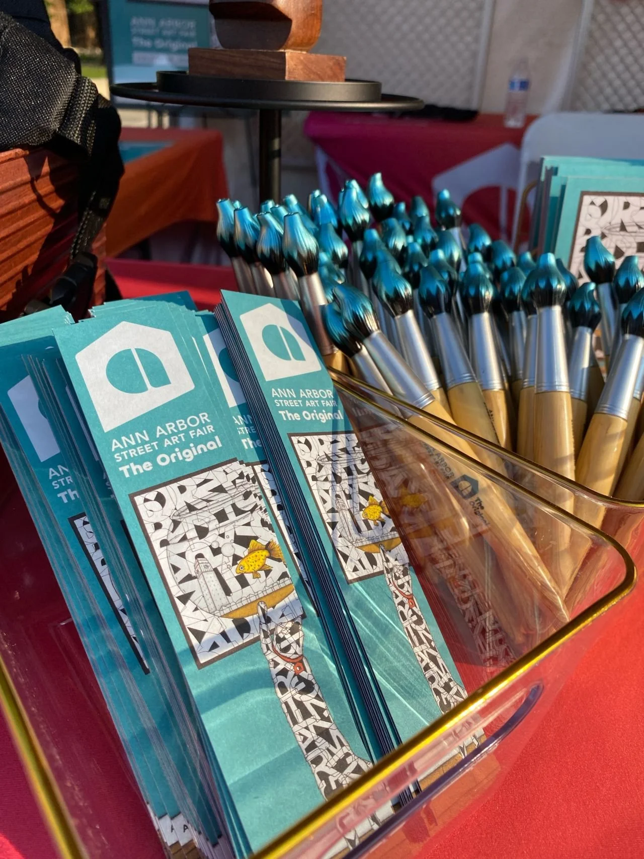
Many fair goers collect our merchandise year over year. We leaned heavily into our commemorative artwork (including the year of the fair if possible) for items produced annually like coasters, bookmarks, and of course tee shirts. But we introduced new items such as fanny packs, post cards, sunglasses, and novelty pens for branded items.
Many thanks to Andy Adams for providing more artwork in addition to his poster imagery so I could create such a wide range of shirt designs.


